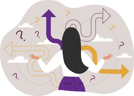
Chip Boyd

Brewmaster

Mailstrom – Finally Getting a Handle on Your Inbox

Inbox

Image source :http://www.sxc.hu

Dealing with your inbox is pretty awful. It only gets worse as we advance in our careers, and as more Luddites give in and join us here in the 21st Century. In the end, every one of us needs some kind of inbox solution.

Mailstrom is a web application that helps you move towards “Inbox Zero,” when you have no more unattended-to emails in your inbox, cluttering your life. It scans your Gmail account and breaks things down by sender, subject, topic, etc., and allows you to archive or delete them. It also tracks your progress.

Gotta tell you, I’m a fan so far. I used it to get rid of a lot of junk that I had in my Gmail account, and am now operating with a much cleaner inbox.

Have you found a great email tool?

KALQ: A New Way to Type on Smartphones

We all know QWERTY. We look at it almost every day – if not on our computers, then on our phones.  And how many times have you thought about sharing your terrible, hilarious auto-corrected message that only happened because you were trying to type – with your thumbs – and missed a letter or two? keyboard

Enter KALQ.  It’s an app that splits the keyboard in two, separating vowels and consonants and relegating less-used letters to the margins of your thumbs’ reach. Once users get a feel for it, researchers found they were 34% faster than their QWERTY counterparts.

Developers released KALQ on May 1, 2013, and it’s only available for Android at present, but it looks pretty exciting to smartphone users who are tired of having to apologize for texting something embarrassing to their mothers.

Read pre-release articles here and here.

Have you used the KALQ keyboard on your Android phone? What did you think?

Maria Lima

Manager of Special Projects

Excel to Wiki Converter: great online tool

At Matrix Group, one of my tasks is to help keep up our internal documentation in our staff wiki. We use MediaWiki, which is a great tool, however, after more than a decade of hand-coding HTML, some of the wiki coding made me crazy.

MediaWiki has some great help pages, but when I had to transfer a huge spreadsheet from Excel into the wiki, I nearly tore my hair out. The wiki coding is a bit clunky and doing it by hand would have taken me days.Excel-to-Wiki screenshot 2

Thanks be to Google! I found a great online converter tool that is both simple and free: excel2wiki.

It’s dead easy – just copy your cells from Excel, paste into the text box and submit.

Voila! The result displays on the screen and all you have to do is cut and paste into your wiki page. Simple, right?Excel-to-Wiki screenshot 2

This has saved me hours of coding!

What nifty time-saving tools have you found recently?

Maria Lima

Manager of Special Projects

Staff Favorite: Chrome Experiments Stars

This is quite literally epic. If you want to spend lots of time on a bit of science, beautiful imagery, and addictive interactivity, visit http://workshop.chromeexperiments.com/stars/, a visualization of the stellar neighborhood created for the Google Chrome web browser.

The disclaimer is the best: “Warning: Scientific accuracy is not guaranteed. Please do not use this visualization for interstellar navigation.”

Got any nifty science sites you like?

Kelly Browning

Information Architect

User Experience: Megamenus

Megamenus are big menus.CAS menu

I mean, as far as details go, they’re a bit more complicated than that.  But the essence of a megamenu is that it’s a Great. Big. Layered. Menu.

Also, they’re a big trend now.

Big.

The more precise definition of megamenus is this: Megamenus are panels of links revealed by a user interaction. These panels are bigger, wider, and hold much more information than the menus you’re used to seeing.

Why Use Them?

If you have a content-heavy website, chances are that you have many different categories of information that users will need to be aware of and choose from.  One layer of information isn’t going to cut it because there are just too many options of equal importance that a user needs to get to easily.

Megamenus, if designed and programmed properly, can make it easier for your users to make those decisions, and give them a fast-forward path to their destination. Users don’t have the time to sift through your site, discover all of the options, and then carefully choose among them. Giving users an accurate and thorough set of links to evaluate means they don’t have to explore your whole site to find what they want; it also prevents them from having to pull up a model of their options from within their own short-term memory. I promise that they won’t forget that there is a section called “Scientific Research” because it’s directly in front of them.

Note the words easier and easily. Choosing among many options requires mental effort of users.  They’ll leave your site if you make things hard for them, so make it easy for them. Basic UX. Learn it; love it.

What It Means for You, the Designer

Again, ease of use is going to be what drives you, here. Megamenus provide a design space where multiple choices can be visually grouped. This grouping helps users make sense of the options available to them.

A big, unlabeled, unordered pile of links will just confuse and frustrate your users. They will leave.

Vertical menus don’t offer the layout flexibility. When vertical menus contain a lot of items, they can begin to feel overwhelming for many users. They will leave.

While designing and implementing megamenus, you can include icons, imagery, and even user controls like checkboxes and search fields. A warning, though: Triggering the menu from a user’s click in your megamenu is preferable to a hover. Activating menus by hover can cause a sense of instability that adds to user stress while attempting to interact with inputs / controls. Have you ever hovered over a menu item and tried to hover over to the sub-menu that pops out of it, only to have everything disappear? Horrible! They will leave.

Don’t make them want to leave.  Use this opportunity to find the balance between information and infodump.  Make it interesting rather than overwhelming.

An example of a mega menu that uses click, not hover, to reveal is NPR.org (see the ‘Programs’ and ‘Listen’ items.)

Articles for Further Reading

Mega Menus Work Well (Jakob Nielsen)
http://www.nngroup.com/articles/mega-menus-work-well/

Designing Dropdown Menus: Examples and Best Practices (Smashing Magazine)
http://www.smashingmagazine.com/2009/03/24/designing-drop-down-menus-examples-and-best-practices/

Counterpoint

6 Epic Forces Battling Your Mega Menus (Jared Spool)
http://www.uie.com/articles/mega_menus/

Sarah Mills

Senior Designer

GOV.UK Design Principles

Recently Gov.uk won design of the year, which is discussed on Design Observer. I love that Government Digital Services decided to publish their design principles that clearly lay out how they tackled such an enormous project. Gov.UK home page

Start with needs*

Do less

Design with data

Do the hard work to make it simple

Iterate. Then iterate again.

Build for inclusion

Understand context

Build digital services, not websites

Be consistent, not uniform

Make things open: it makes things better

As a huge fan of open source in general, I feel designers (and PM’s, devs, etc.) do their part when they publish lessons learned and case studies. This list of principles applies to everyone working on the web now, and it is something our clients should read to understand the process. Honestly, I am pretty sure these principles (and handy examples) apply to more than just web nerds. For instance:

Government should only do what only government can do. If someone else is doing it — link to it. If we can provide resources (like APIs) that will help other people build things — do that. We should concentrate on the irreducible core.

We’ll make better services and save more money by focusing resources where they’ll do the most good.

In the future I am going to do more to document my process—not only to share, but to improve and grow. My biggest takeaway from this list was the last:

Make things open: it makes things better

We should share what we’re doing whenever we can. With colleagues, with users, with the world. Share code, share designs, share ideas, share intentions, share failures. The more eyes there are on a service the better it gets — howlers get spotted, better alternatives get pointed out, the bar gets raised.

What principles and best practices in your line of work apply not only to your industry?